‘The Illustrator’ Katharine Asher.
By Hannah Isaacs.
In this essay I will compose an original investigation into an established 20-21st century illustrator’s life and work, exploring and considering influences and inspiration, practice, working methods and process, idea generation and placing the work into social and cultural context. Having picked a successful and well established; however not very well known illustrator, it was not possible for me to contact her for further information and a better insight and knowledge into her work and life as no such contact was provided. Likewise the only sources available for information were from the internet and one interview; no books, monographs or journals are available about my chosen artist.
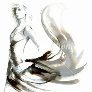
Katharine Asher is an established 21st century freelance illustrator and designer, specializing in fashion and figurative work. Katharine creates her wonderful illustrations in her two story studio shared with two other businesses, in the converted hayloft in the original stable block of her home in Bristol where she lives with her children, after relocating there from London because her ex-husband worked for the natural history unit for BBC Bristol. I originally stumbled upon her work when I was browsing on the website ‘Illustrationweb.com’, in search for inspiration and adaptation for my own style and inspiration for my work. I was instantly mesmerized by the nuanced beauty of her lifework. The realistic shading and detail against the fun juicy watercolour light strokes express a real heart-warming quality. The soft and natural strikes of the paint brush seem to effortlessly dance across the page, every stroke as fluent and as casual as the next. A beautiful example of the elegant movement within the way the illustrator works the paintbrush is in the image below. In this image, it is almost impossible for the viewer to imagine the dancer standing still; we fantasise about her movement and poise as she delicately but fiercely seems to possess the ability to dominate the page. Recreationally, Katharine has always danced; mastering dance forms such as salsa to west coast, swing and even jazz. One may argue that this skill and talent has been a subconscious influence on the way she naturally dances the paint across the page.
The illustrators prior training in art include a diploma in graphic design at The College of Art and Design in Torbay, further education at The Harrow college of art based in London and BA Honours degree in fine art at UWE Bristol; specializing in Sculpture. Katharine has said on her personal profile write up on the website ‘illustrationweb.com’ that her studies at Harrow college of art focused predominantly on illustrating a thorough understanding of movement and anatomy, the ability to think in three dimensions and lastly what she considered most important; on strong traditional drawing skills. Katharine explains ‘this has proved to be the backbone of my skill base’, the illustrator says it has enabled her to attract work from a wide range of commercial sources from publishing and advertising and even to film. Katharine likes to keep her work in line with commercial trends and her focus fresh by continually evolving her style to what the public seem to want at the time. She would rather create a piece of art work based on the requirements of the clientele rather than for her personal pleasure, admitting in an interview with journalist Vicky Pierce; ‘the commission is the inspiration for my work’, continuing to explain that she sees illustration as a very secondary job. However, the artist of course finds influence and muse in other artists, who curiously do not resemble a similar style or even subject to Katharine’s classic fashion illustrations. These artists include: British sculptor Cathy de Monchaux, Polish Art Deco painter Tamara de Lempicka and Swiss painter Alberto Giacometti.
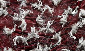
Cathy de Monchaux ‘Unicorns’
Cathy de Monchaux has a very intimate and delicate way of working. Her images include subject matters such as disquieting intensifying images of dying unicorns, falling figures and battle scenes. This seems an interesting artist for Katharine to take inspiration from, however we see great movement and fluency in the way this artist works; the piercing movement Cathy has depicted in the unicorns suggests such pain and discomfort. The unsettling use of the dark red colouring in the velvet like background portraying the emotion of pain contrasts against the white unicorns; the colour of innocence and purity. Katharine too has the ability to tell a story just using brush strokes and an effective choice of contrasting colours. No matter how simple Katharine’s ideas are, or indeed Cathy de Monchaux’s illustrations, we cannot imagine them static; they come to life before us.
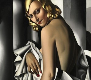
Tamare de Lempicka ‘Tubular Belles’
Tamare de Lempicka was the most famous painter of the 1920’s art Deco period. Appealing to the rich, her portraits (including Tamare’s self-portraits) consisted of bold use of colour, a unique style and a sense of elegance that permeated her work; a classic interoperation of an art Deco piece of artwork (an influential visual art and design movement, appearing first in France during the 1920’s; an electric style combining traditional craft motifs with Machine Age imagery and lavish ornamentation.) Katharine has said that she has a great love for anything from the art Deco era, telling the interviewer that if she could travel back in time to any period it would be non-other than the 1920’s. Despite the illustrator’s inspiration and undying love and respect for the era; Katharine shows no obvious resemblance to Art Deco in her illustrations.
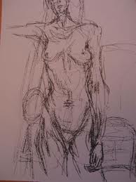
Alberto Giacometti Unnamed image
Alberto Giacometti is a more obvious inspiration for Katharine in comparison to her other choice. Although there is no beautiful finish, colouring or certainty about this image, I can see how the illustrator could turn to Giacometti for reference and guidance. This drawing portrays the naked form of a woman. Like Katharine, the artist has used what mirrors rushed and carefree lines. Alberto Giacometti seems to draw the form not in the correct proportion; one can only assume this is the artist creating some sort of character to the figure. This could be the source of Katharine’s inspiration and attraction for Alberto Giacometti’s work; taking a simple idea and making it interesting to look at with a unique technique weather this is by elongating the length of a figure or playing with the amount or lack of detail in a portrait to accentuate other features; a technique Katharine uses in many illustrations, including the one below.
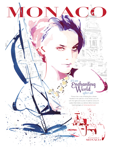
Even though Katharine may not find inspiration in illustrators who paint in the same style and clear content as her; many successful artists are creating work in a similar style to hers and are even producing pieces for world class companies, allowing them to grow to be a lot more well-known, recognised and celebrated than her.Much like Katharine, Christian David Moore is a freelance illustrator and designer specialising in figurative work. Evolving his style to allow his work to remain exciting and varied; at the same time meeting the standards of the client, Christian likes to have a flexible approach, allowing constant experimentation with traditional mediums. Thriving on the pressure of tight deadlines, the illustrator has an impressive client list including many renowned names such as Monaco Tourist Office, Tatler and Chanel. “For me fashion isn’t just about clothes – it’s also about conveying ideas, attitude and personality. I draw inspiration from pretty much everything around me. I am fond of good food and wine, sailing and beautiful women. I like enterprising people who are not afraid of risks, enjoy every minute of life and do it with elegance”. This is a quote from Christian’s website, explaining his passion and inspiration for his work. Illustrators often find their best inspiration comes from life. Illustrators are very creative and imaginative people, finding pleasure in other hobbies to unwind, which unknowingly often influences the context of their work and/or the style, relating to (as I mentioned previously) Katharine used to dance, implying the rhythmic manner she handles the paintbrush could have been influenced by this hobby of hers.
In the same interview as mentioned earlier, Katharine was asked to explain how she came to be an illustrator, in which she reminisced; ‘Growing up on a farm on Dartmoor, I used creative play to fill the social void and now I make a living from my favourite past time, how lucky am I?’ the illustrator laughs. She then continues to tell us that unaware to us, collected bones are the main theme of her artwork. The bones have been collected by herself over many years from Dartmoor. These consist of mainly animal skulls; shed skin from reptiles, insects, snakes and spiders. Katharine insists ‘it feeds an interest in growth and transitional states’. It seems that collections are somewhat of a hobby for the illustrator, collecting masks from around the world and percussive instruments that are made from natural objects such as seeds, husks, gourds etc. It is unclear to the viewer’s how the illustrator incorporates her inspiration from her personal collections into the art work in which she creates.; one can only guess this is the texture imbedded in the illustrations, but still this is not very clear.
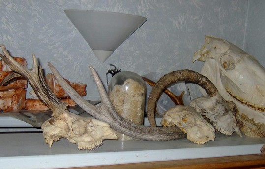
A photograph of Katharine’s proud collection of animal skulls, found on her website.
Because Katharine is constantly evolving her style and subject in order to fit to the brief explaining what is required for her to create, the method and process are rarely kept the same. The illustrator likes to start any illustration with a well thought plan; she plans the composition, the colours and of course the style; sometimes, in fact more often changing dramatically, always the main focus being on who the illustration is for; who the audience are and what they expect to see, taking in to account what would be appropriate.
This is a dramatic style leap for Katharine. The illustrator is out of her comfort zone, swapping her watercolours for Photoshop colour filler and her beautiful carefree strokes to a hard black outline. This is a perfect example of the illustrator’s versatile ability to shift her style into whatever she is commissioned to create; this ability makes it hard to place Katharine in any particular social or indeed cultural context.
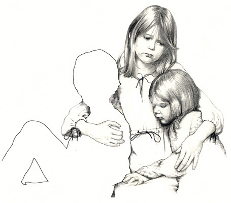
This image really stuck out to me among the other images I found. We see beyond the glamorous lively watercolour, to a much more technical, realistic study of two young girls. We are not sure who the other person is and indeed why they are blank. Likewise, We are not told who the girls are and why they look so sad. The artist could be portraying a memory; the girls are young and judging by fashion; the image looks to be set in earlier times. The blankness of the figure suggests the person is there in body however not in mind. This change of style and content could be the illustrator’s way of expressing her feelings through her own art as opposed to meeting the desired standards of the clientele for a change. We have no evidence this wasn’t painted for commission; however one thing that is made clear through this painting is the definite skill we see in the detail of the painting. The glamorous lines and colours are stripped away and we are left with a technical, painfully detailed capture of an emotion; possibly sadness and loss.
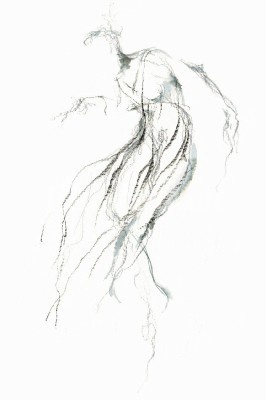
Another unnamed image I have found on her website appears the artist is leaping out of her comfort zone once again. Only can we guess this image is a portrayal of a female torso from behind; the drawing is so hard to read it could almost be considered abstract. This again is an obvious change from her comfortable painting style; the use of the brush is much more reserved and focused to the attention of detail. Even though the drawing is less static than the last image; the lines are more vibrant and seem to glide around the page; in contrast to any other Katharine Asher illustration, one cannot easily identify the subject of this image.
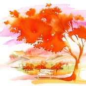
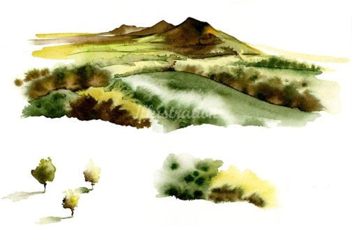
Katharine’s nature illustrations are endearing and heart-warming. Although completely different to her comfortable subject, her soft and elegant painting styles really compliment these illustrations. Even though in both images Katharine has used fairly piercing colours, there is something subtle and very effective about the bleeding paint and the colours that bring both images to life.
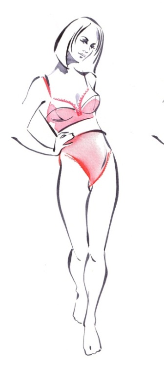
The artist is back in her comfort zone; illustrating fashion, however veering into another era now. This lingerie is thought to be inspired by the 50’s. Again, lack of information on the illustrator means that we have no way of knowing who commissioned this picture, one can only assume it was for a lingerie company or something of equivalence.
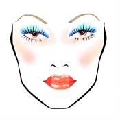
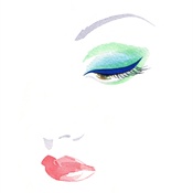
Powdered face, red painted lips, beautiful eye makeup and thin dark brows suggest the illustrator is interoperating the face of a Japanese geisha. Again, Katharine is still in effect illustrating fashion, however adjusting to fit another culture.
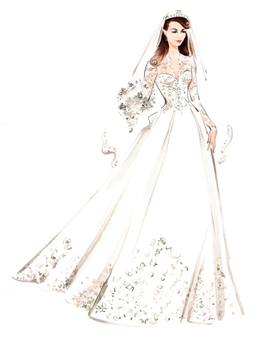
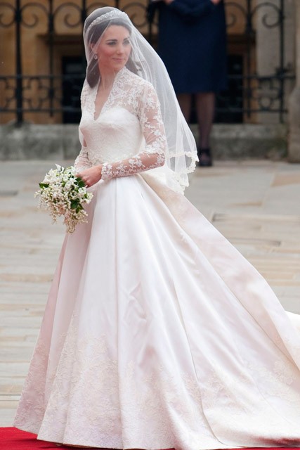
Here Katharine has illustrated a young bride in what looks to be a vintage bridal dress, identified by the delicate detail and beading on the dress accompanied with the netted attention around the models neck, continuing down her arms. Whom this design was created for; public appreciation or a particular clientele, we are unsure. However it is likely that this commission was in fact influenced heavily by social and cultural context; the popularity of programmes such as Downton Abbey (a heavily celebrated British-American period drama television series) dramatically increased the demand for vintage clothing including influenced wedding gowns as well as a new found love for the 1920’s. Likewise, the Duchess of Cambridge Kate Middleton wore a very similar gown on her wedding day on 16 November 2010 designed and made by English designer Sarah Burton, creative director of the luxury fashion house Alexander McQueen. This could suggest the illustrator was commissioned to illustrate the princess on her big day for perhaps a magazine or an aspect of the media.
Katharine has an impressive list of clients ranging from worldwide cosmetic companies including Max Factor and Elizabeth Arden, Italian fashion label and designers Giorgio Armani, and has even supplied the media with her illustrations, including the BBC and the Mail on Sunday.
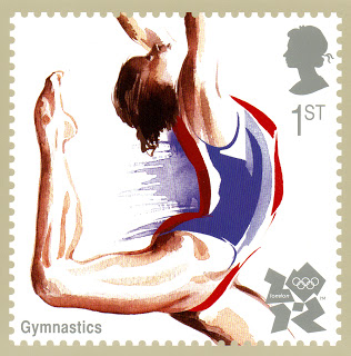
Another impressive achievement for Katharine is the stamp she created for London 2012. The illustrator was thought to be generously commissioned by producer David Hillman to paint a kinetic gymnast proudly supporting the colours of her home country in 2011. The stamp was to appear in a book of illustrated stamps in the run up to the exciting event in the following year, accompanying other fine talent chosen by the producer.
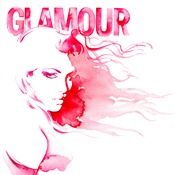
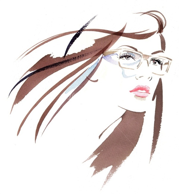
Katharine was asked to do an illustration as if it was a ‘Glamour’ cover, which was then printed on small notepads and given with the magazine to all customers. I actually have one myself and thought it was a beautiful illustration, I even attempted to copy the painting myself, unknown to me that this was the work of Katharine Asher and that I would be composing an essay about her more than a year later. This is the style and subject the artist is most celebrated for. The fluent use of the brush against the clumsy way the water colour is applied to the paper looks effortless for the illustrator. The immense detail in the face contrasted against the faint strokes of her hair look as if they have been created so natural almost an accident.
In conclusion, I find the work of Katharine Asher’s to be very pleasing to look at. The illustrator has a wide range of different skills, styles and technique’s, including the versatile ability to adjust to whatever it is she is required to create, pleasing any audience and beautifully capturing any subject matter, appealing to any audience whatever social and cultural context is necessary. If I were given this essay question again however, I would have chosen a much more established artist. Even though I was so instantly drawn to the works of Katharine Asher, I found it hard to gather information about her, due to limited information sources about the illustrator’s life and work. However I am glad I did not give up and persevered with my artist choice. I feel that not enough people know about this illustrator; and investigating her deeper on my own accord, sharing the information I have gathered on my blog will hopefully inspire other aspiring young artists to create beautiful work like this.
